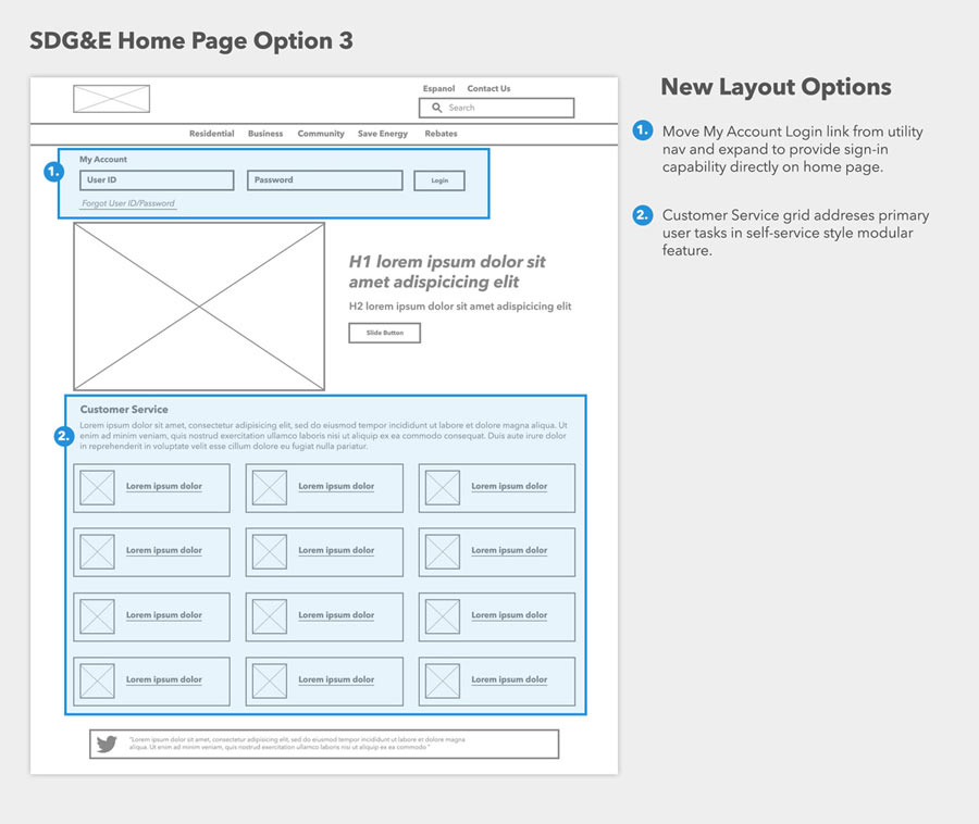
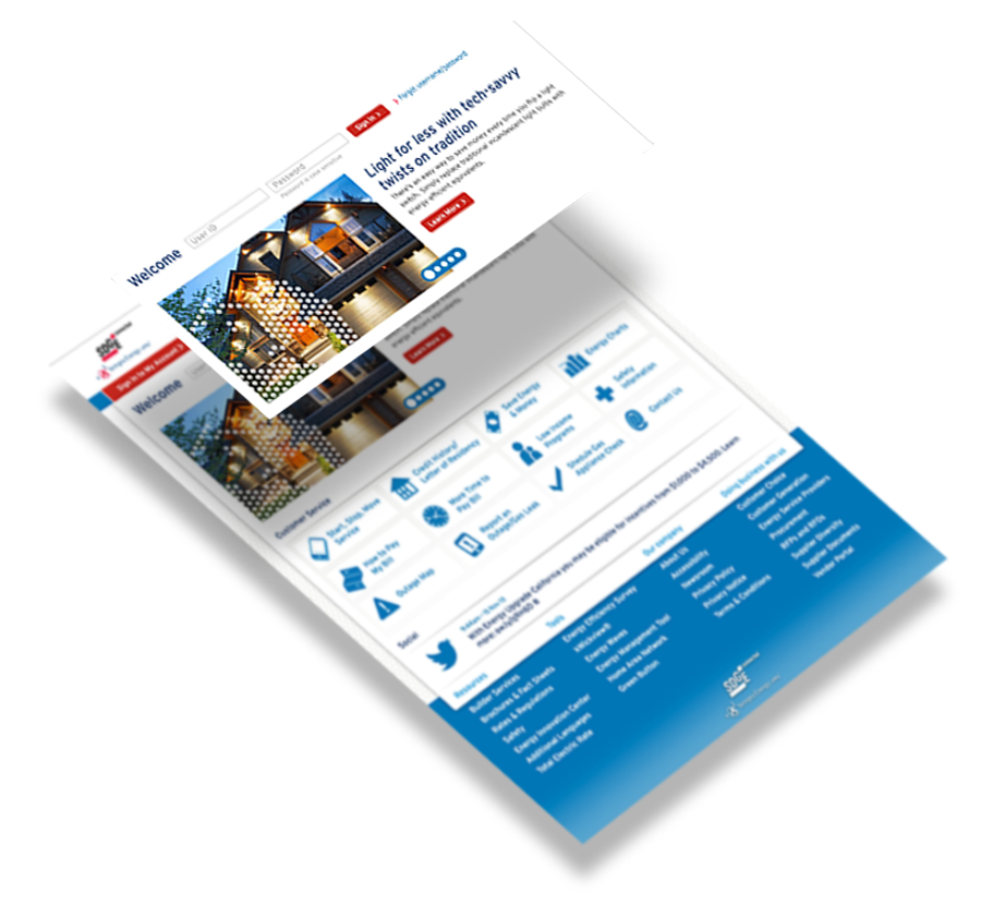
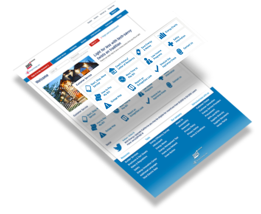
SDG&E

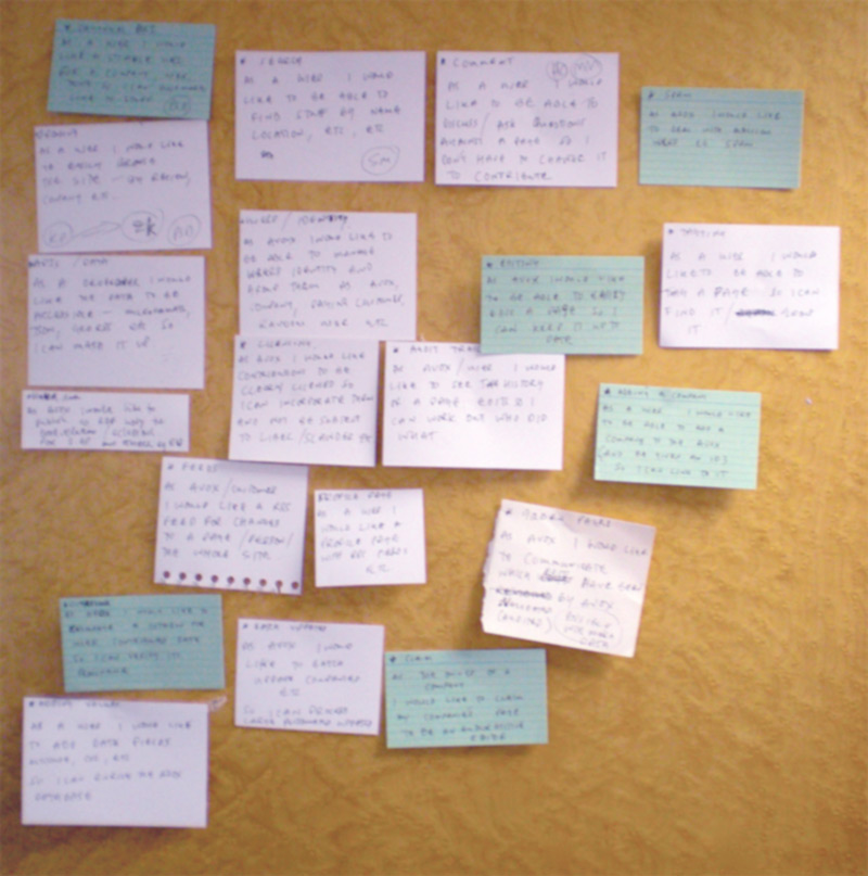
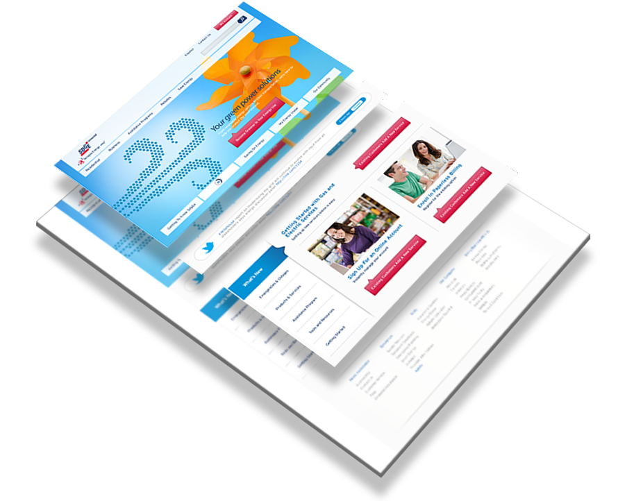
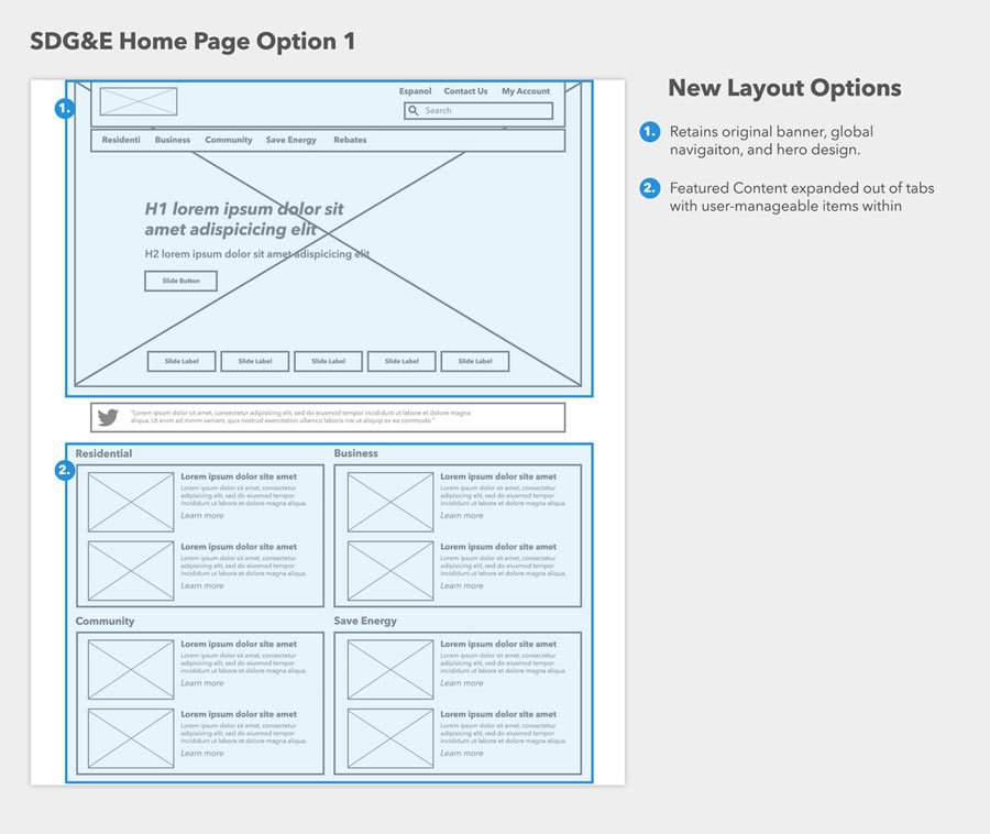
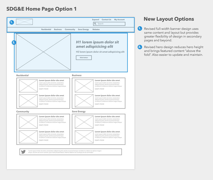
I was the lead interactive designer at San Diego Gas & Electric when we started redesigning their website in 2011. It was a major undertaking with thousands of pages of content and strict regulatory standards to meet. The results redefined industry standards for web design.

“Skin in the Game”

For the first stage of the redesign, I was embedded with SDG&E’s agency of record as a dedicated member of an agile team. Agile was new to me, and I became a true believer in the process, iteration, and collaboration prescribed in Agile methodology.

Having briefly begun the project on waterfall-stlye project management, we were pulling our hair out trying to make the schedule work. I fully credit the Agile process with making it possible to launch a site of this scale in half a year.

Full agile might not be the right solution for every scenario, but its principles of flexible planning, early delivery, iterative improvement, et al are applicable to most large-scale interactive projects.

Minimum Viable Product

Our first efforts prioritized evergreen image-heavy content to engage users and embody SDG&E’s new brand direction of being “Connected” to customers–a stark contrast to their prior reputation as an indifferent and impenetrable monopoly. A “full-page” hero promo, prominent Twitter feed, and dynamic news section fit contemporary design principles and best-practices.

Our first version featured a large hero image, and large amount of tabulated featured content.

Six months into the project, we launched our MVP. We spent another half of a year iteratively dialing-in styles and structures, developing advanced features, and testing the site via usability sessions and analytics.

Iterate, Test, Refine

While huge splashy hero images look great, and users’ scrolling proclivities are generally well-documented, usability testing combined with screen resolution analytics convinced us to scale our hero image down significantly to better fit our users’ slightly smaller-than-average screen resolutions.

We explored options to revise the homepage based on analytics and usability testing.

We refactored our hero section to reduce it’s height, matching median user monitor analytics as well as to make it easier to update and maintain for internal stakeholders.

We also found our tabulated content further down the homepage was not engendering the desired traffic, and further testing showed users came to the site looking for self-service options or customer service links much more than they did news about the utility.

The tabulated featured content was replaced with a “Customer Service Grid” representing the top visited content with the goal of reducing call volume to the call center.

We retooled the homepage to present a grid of customer service options, consolidating the most popular items from around the site. This was a great success for both internal stakeholders as well as customers.

That’s Great, but can it be Responsive?

At the start of the redesign, it was still common to maintain a separate mobile-specific site. We attempted a Drupal mobile view to combat the obvious downside of maintaining two sites, but technical difficulties combined with the rapidly growing responsive movement led us to revise the site responsively over the next six months, further establishing SDG&E’s website as the new industry standard.

When we started the project, responsive web design was still a novel idea, and “Mobile First” hadn’t even been released. By the time we launched our second major update, it was an obvious requirement, and we spent the next six months updating the entire site.

Other Projects