Adaptive Cards for Agentic UX
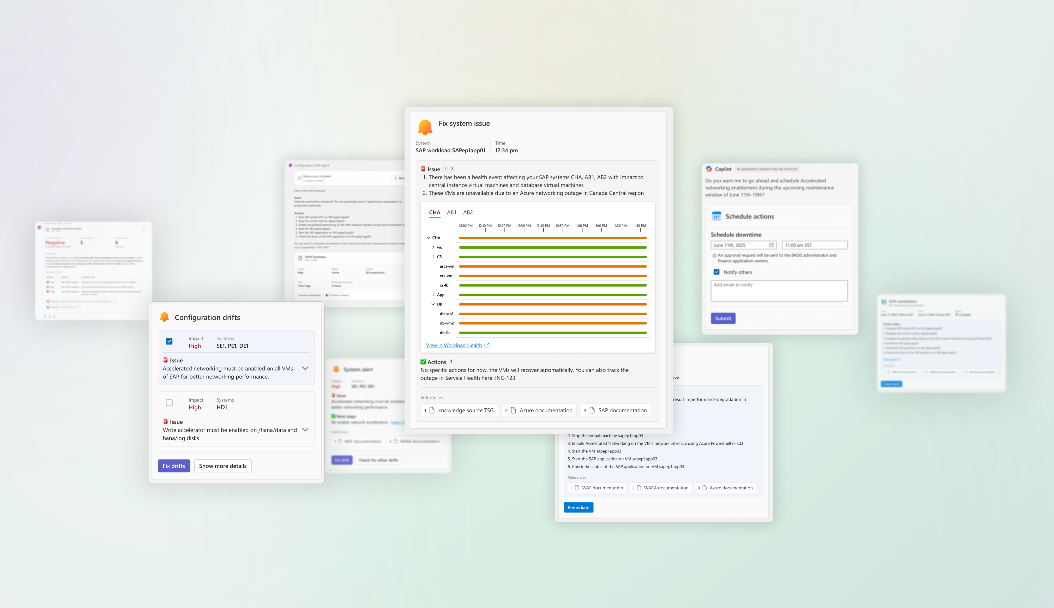
Modern Azure customers operate mission-critical systems where complexity is unavoidable and mistakes carry real consequences. The agents supporting these environments were already capable of reasoning over vast amounts of configuration and operational data. The problem was not intelligence—it was expression. Agent output was dense, linear, and difficult to inspect at the very moments when users needed clarity, confidence, and control.
As the lead designer, I explored how structured output—specifically Adaptive Cards—could transform raw agent responses into legible, inspectable payloads. The goal was not to simplify the domain, but to make system state, assumptions, and decisions visible and reviewable under operational pressure.
- Role
- Lead designer
- Timeline
- Jul 2025 – Dec 2025
Why this problem exists
The agents I worked on were designed to help manage the complexity associated with mission-critical Azure workloads. They needed to be intelligent, autonomous, and workload-aware—capable of reasoning over large volumes of system data and guiding users through consequential decisions. From the start, this meant that the agent’s outputs would be dense by necessity.
Complexity was not a bug to be removed; it was the domain we were operating in.
Where things broke down
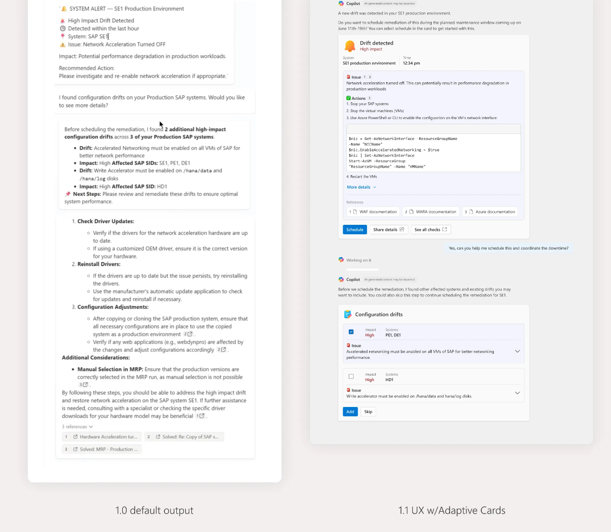
Early versions of the agents communicated exclusively through long-form text. While the information was technically correct and often valuable, it placed an unreasonable burden on users. Responses were verbose, linear, and difficult to scan. Important warnings, assumptions, and recommendations were buried in paragraphs and lists that required careful reading.
Maintaining context while scanning was difficult, and determining actionable steps was burdensome.
The problem was not the information provided by the agent, or even the amount of content; it was that its knowledge was presented in a way that obscured information like system status, decision boundaries, and risk. In high-stakes environments, unreadable information is effectively unusable information.
A different way to think about output
I reframed the problem away from “better responses” and toward better payloads. Instead of treating agent output as a stream of generated text, I began to think of it as a designed artifact—one that needed structure, hierarchy, and explicit affordances for human judgment.
Adaptive Cards emerged as a useful pattern not because they were visually richer, but because they allowed us to impose order on complexity. Cards made it possible to separate summaries from details, surface key decisions, and present system state in a way that could be inspected rather than interpreted.
Why Adaptive Cards
- Reduce cognitive load. Cards enforce structure and hierarchy, making the decision obvious without reading every word. Users don’t have to interpret what to do next—the interface tells them.
- Support micro-tasks. Adaptive Cards are optimized for small, high-frequency actions like approve or reject, choose an option, and acknowledge a status.
- Scale across surfaces. Reduce design fragmentation and implementation variance by ensuring the same card works consistently in Teams chats and channels, Outlook email and actionable messages, and Copilot and bot responses.
- Improve accessibility by default. Cards support structured inputs, labels, and semantics that are more accessible than free-form text replies. Accessibility improves without requiring custom handling per surface.
Exploring structure, not decoration
Initial work happened in Figma, where I explored how complex agent reasoning might be decomposed into scannable units. The focus was on layout, information density, and interaction—not on polish. I tested how summaries, warnings, configuration parameters, and next steps could be visually and spatially separated without breaking conversational flow.
These explorations were deliberately pragmatic. The goal was to help users quickly answer three questions:
- What does the agent know?
- What is it recommending?
- Where do I need to intervene?
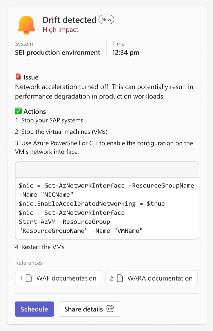
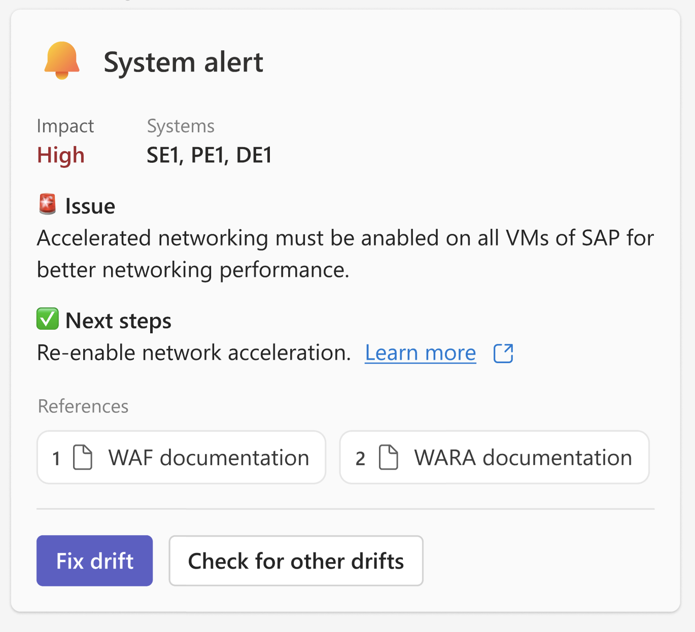
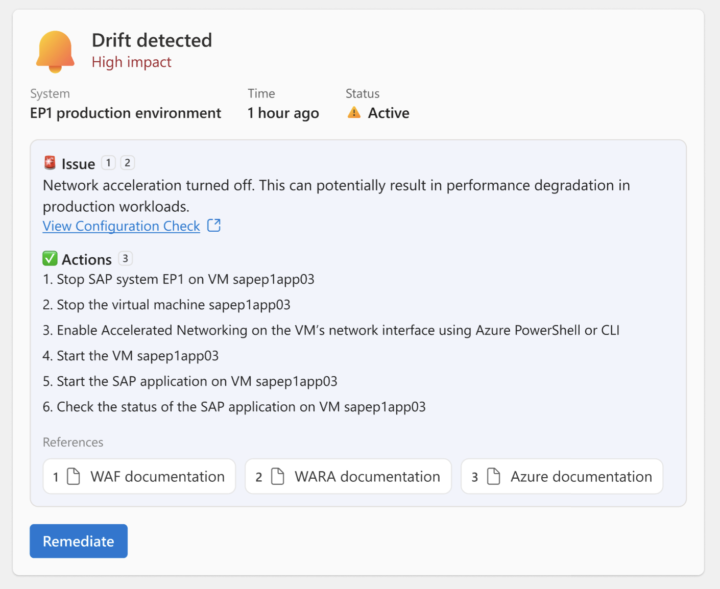
Designing at the point of execution
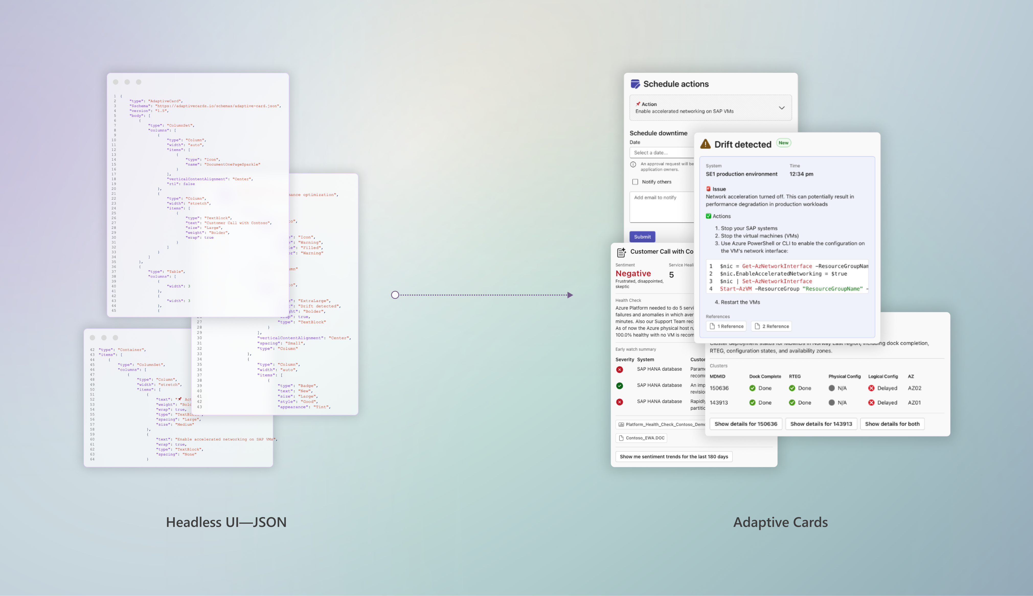
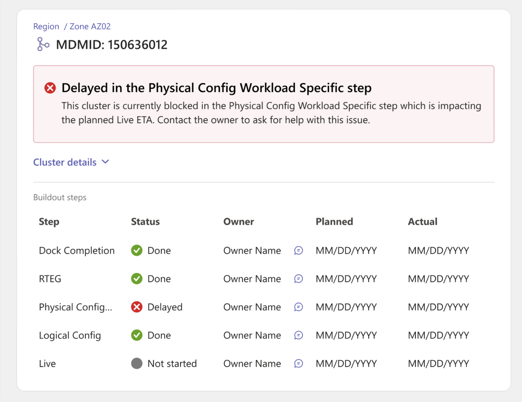
Designer-authored Adaptive Card JSON
As the direction became clearer, I moved out of static design tools and into authoring Adaptive Card JSON directly. Working at this level exposed real constraints: schema limits, rendering behavior, and platform inconsistencies that mockups could not capture.
This shift reduced handoff churn and made design decisions inseparable from implementation realities. It also reframed design work as something that happens inside the system, not upstream of it. In an agentic context, the “interface” is often the payload itself.
Headless UI
Headless UI decouples a component’s state and interaction logic from the presentation layer by defining structure and intent without defining final visuals, styling, or interaction polish. This leaves each host to render the UI in a way that fits its environment.
Adaptive Cards are a headless UI system; they separate what the experience is from how it looks and behaves.
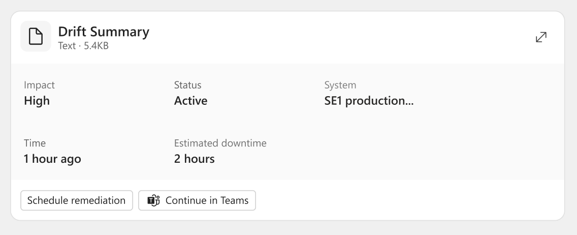
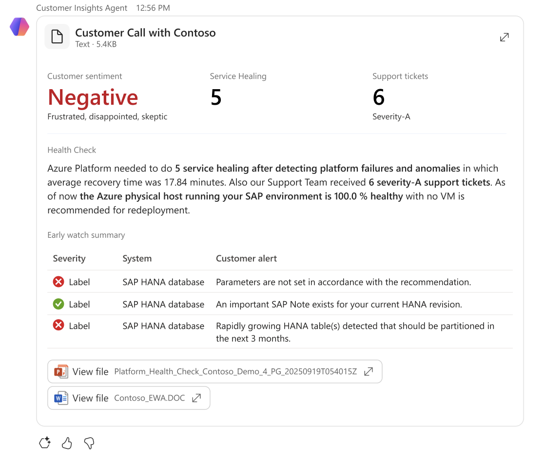
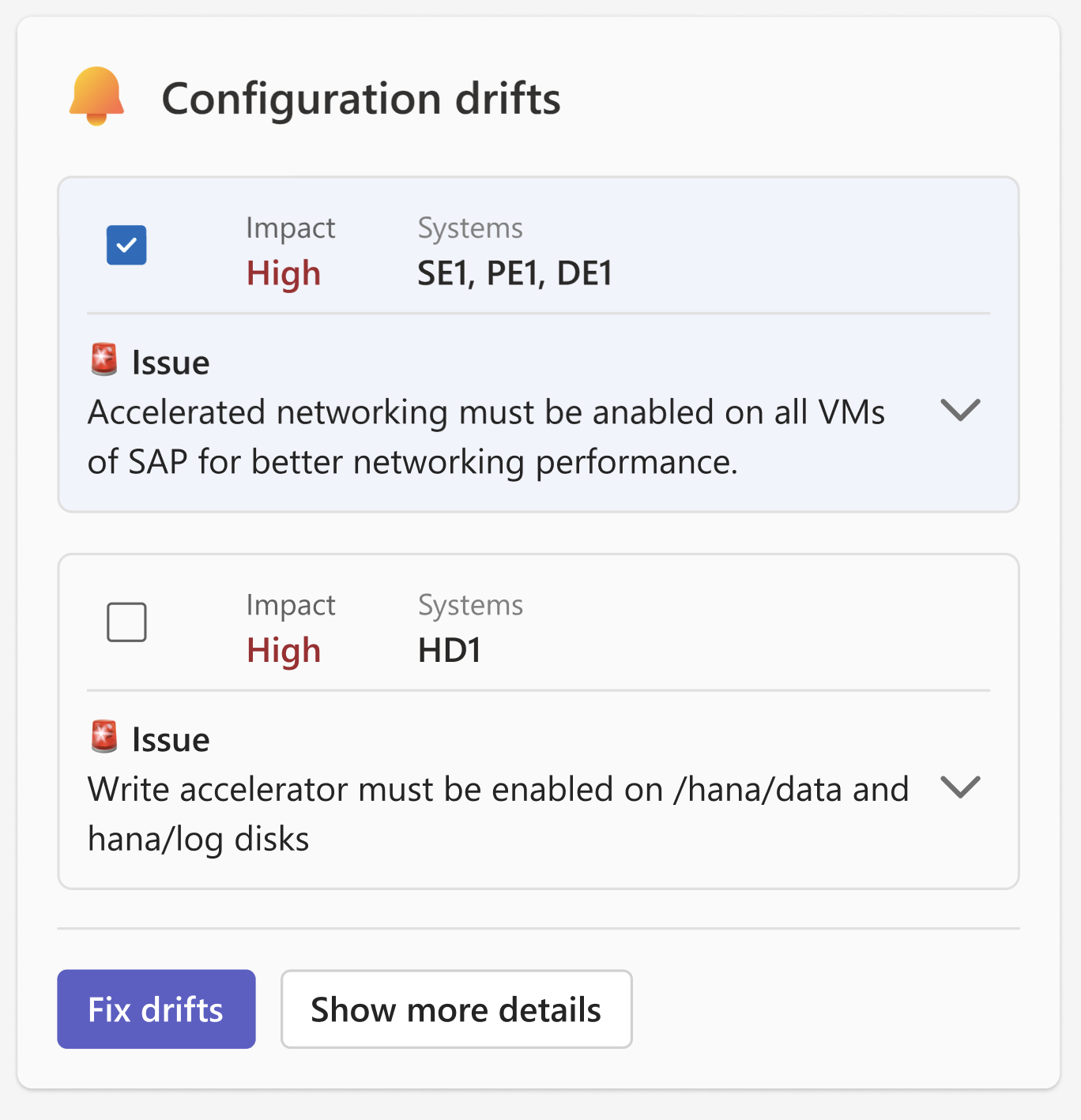
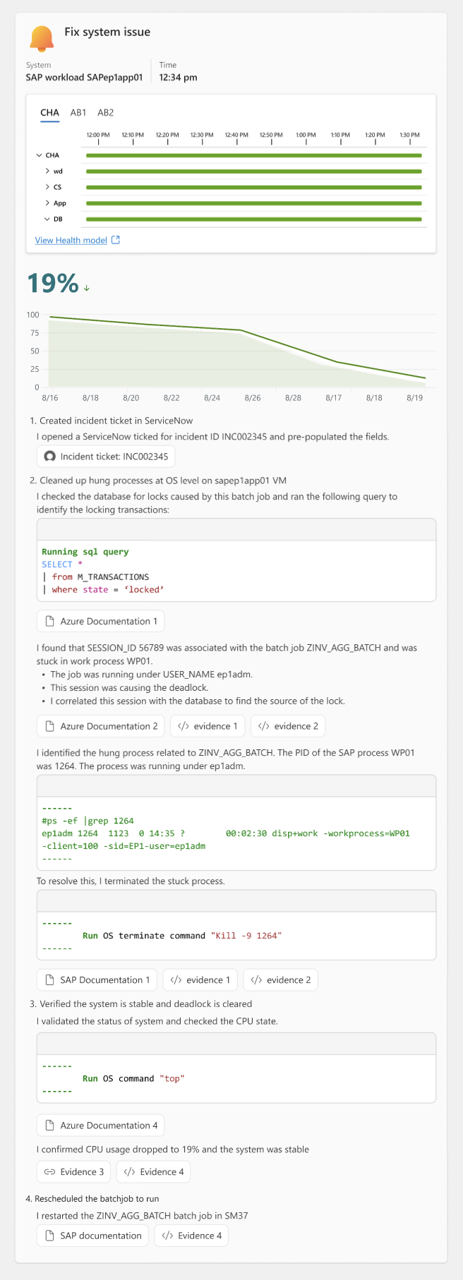
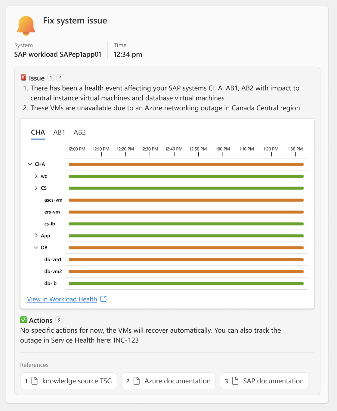
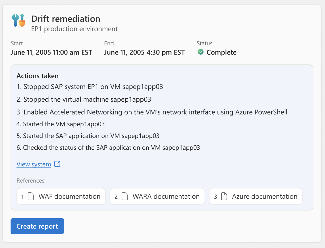
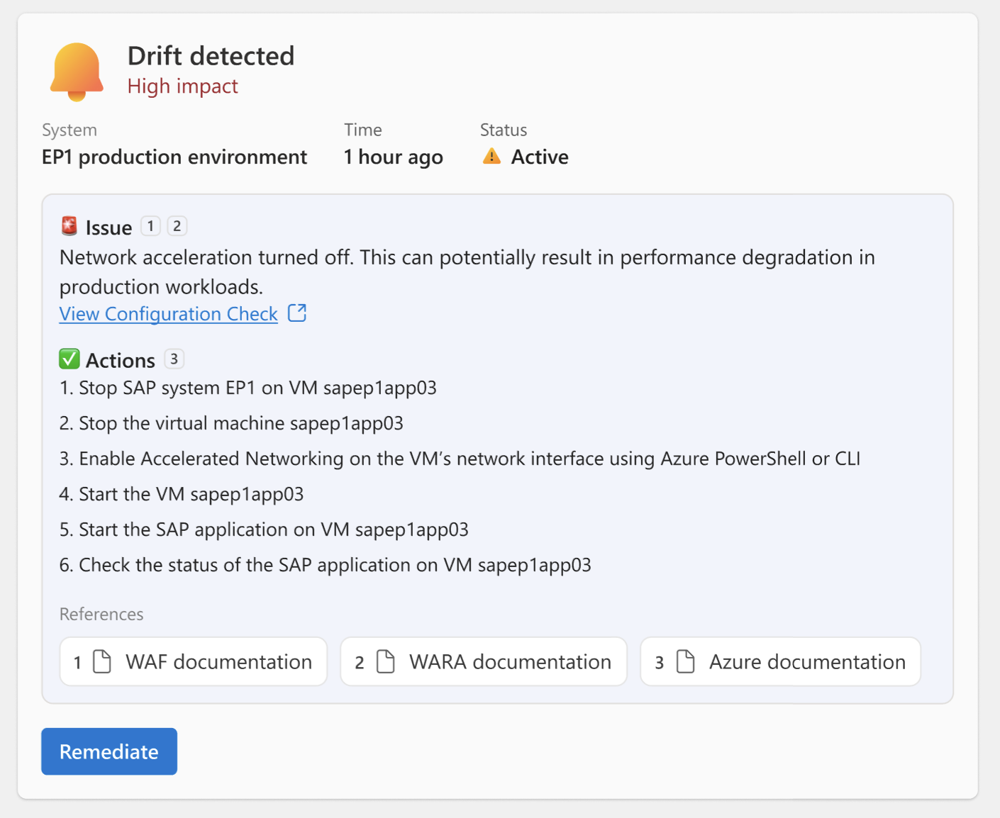
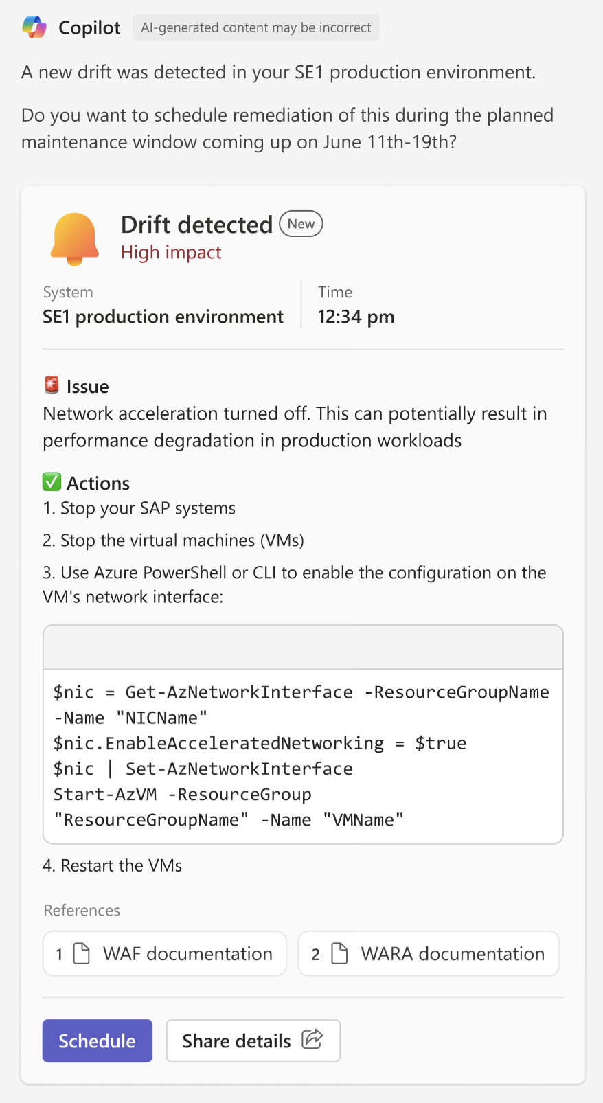
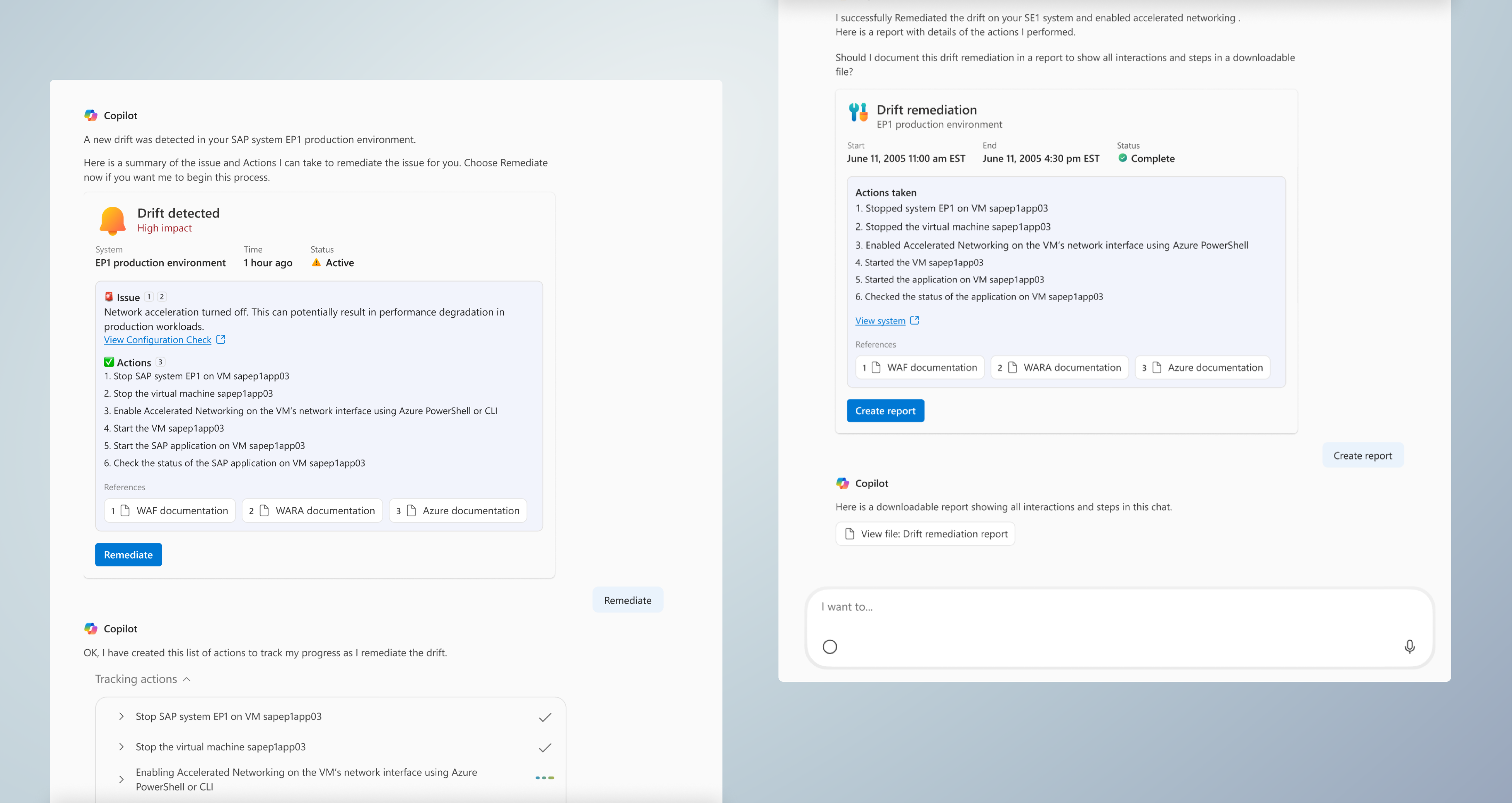
Adaptive Card examples
These are examples we developed for our agentic UI.